If a dashboard is well made, it is super valuable – you see everything important at a glance and the visual representation immediately puts the information in perspective. And if the dashboard is not well made? Then it’s a thorn in your side that you stare at endlessly without learning anything. But what makes a good dashboard?
By developing countless dashboards for Timewax, we have learned what makes a good dashboard. In this blog article you will learn the 8 best practices for creating a valuable dashboard.
1. Identify the main theme
A dashboard is a visual representation of business information. Because it is visual, it provides a direct overview and insight and is easy to interpret. But because you can put an infinite number of KPIs in a dashboard, many people tend to take everything and create a “one size fits all” dashboard. The result? System overload – there is too much information so your users only focus on one part of the dashboard.
So you miss the mark, because the purpose of a dashboard is that you immediately see what is important. So make sure you only include the KPIs that generate the overview you are looking for. Is the dashboard about projects? Think of KPIs such as progress and the results of multiple projects. Is it about resources? Then look at the organization and map out how billable employees, departments and teams are.
2. Find out the usual KPIs in your industry
Don’t reinvent the wheel – you’re probably not the first to create a dashboard for your industry. So, check what are the usual KPIs to visualize.
At agencies, for example, it is customary to look at the costs for people they hire – they eat away more margin than their own employees. But this KPI is of course irrelevant for IT companies that don’t work with freelancers at all, so it’s important to have that clear in advance.
3. Choose one main KPI
Choose one primary KPI that you visualize within the theme of your dashboard. So, if your dashboard on budgeted costs vs. actual costs and the difference therein, then bring this KPI back each time in a different setup.
In the rest of your dashboard you visualize this in, for example, the 10 best and worst performing projects in that area. And then of all the best and worst projects, identify who the project managers are and what department they’re in. In this way you can compare the correct data with each other; if you bring in other KPIs, then you are comparing apples with oranges.
4. Determine the user persona
Who will use your dashboard – is that the project manager, a planner, department manager or the management board? Depending on that, you get a completely different dashboard. For example, the management board wants high-level information and is not interested in all the details: what are the biggest projects and how are they doing? Everything on a macro level.
A project manager, on the other hand, wants a grip on his project. He needs details to know exactly how things are going on a micro level.
5. How mature is the company in dealing with projects?
When creating a dashboard, it is important to know how the company handles its projects. For example, immature companies have long been happy with insight into the budget vs. actuals of their projects.
Adolescent companies also want to know the project progress, because this allows them to make forecasts: what do I expect to end up with if we continue like this? And mature companies? They also want a financial expression that allows them to include cost price rates: how much do we earn on a project?
6. Make your dashboard interactive
As a user, you must be able to filter within the main KPI of your dashboard. For example, you want to be able to look per department, or for all customers within the retail industry. This is called a “drill-down”, where you can, for example, click on the worst project in more and more detail to find out why this project is performing so poorly.
7. Always provide raw data
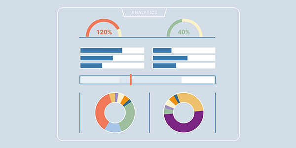
Although a dashboard should be visual, it is important to be able to easily access the raw data. So if you have bar chart visualizations of the 10 best and 10 worst projects at the top, you want to see the raw data of all projects at the bottom: the project names, customer names, budgeted hours, actual hours, differences therein, etc.
With the raw data at hand, you can always validate whether the correct data is included in the visualization. A project that you expect to perform the worst may still be #11 and therefore you will not find it in your bar chart – you can easily check that in your raw data.
8. Make your dashboards available in a targeted manner
If your company has 30 dashboards, that’s way too much for your users. After all, it is never the case that all facets and all details of the company are important to everyone. If 3 dashboards are relevant for project managers, then they should only be able to see those dashboards and not have access to the others.
So, remember: the main reason for creating and having a dashboard is overview and insight. If you follow these 8 best practices, you automatically ensure that you guarantee this at all times.